

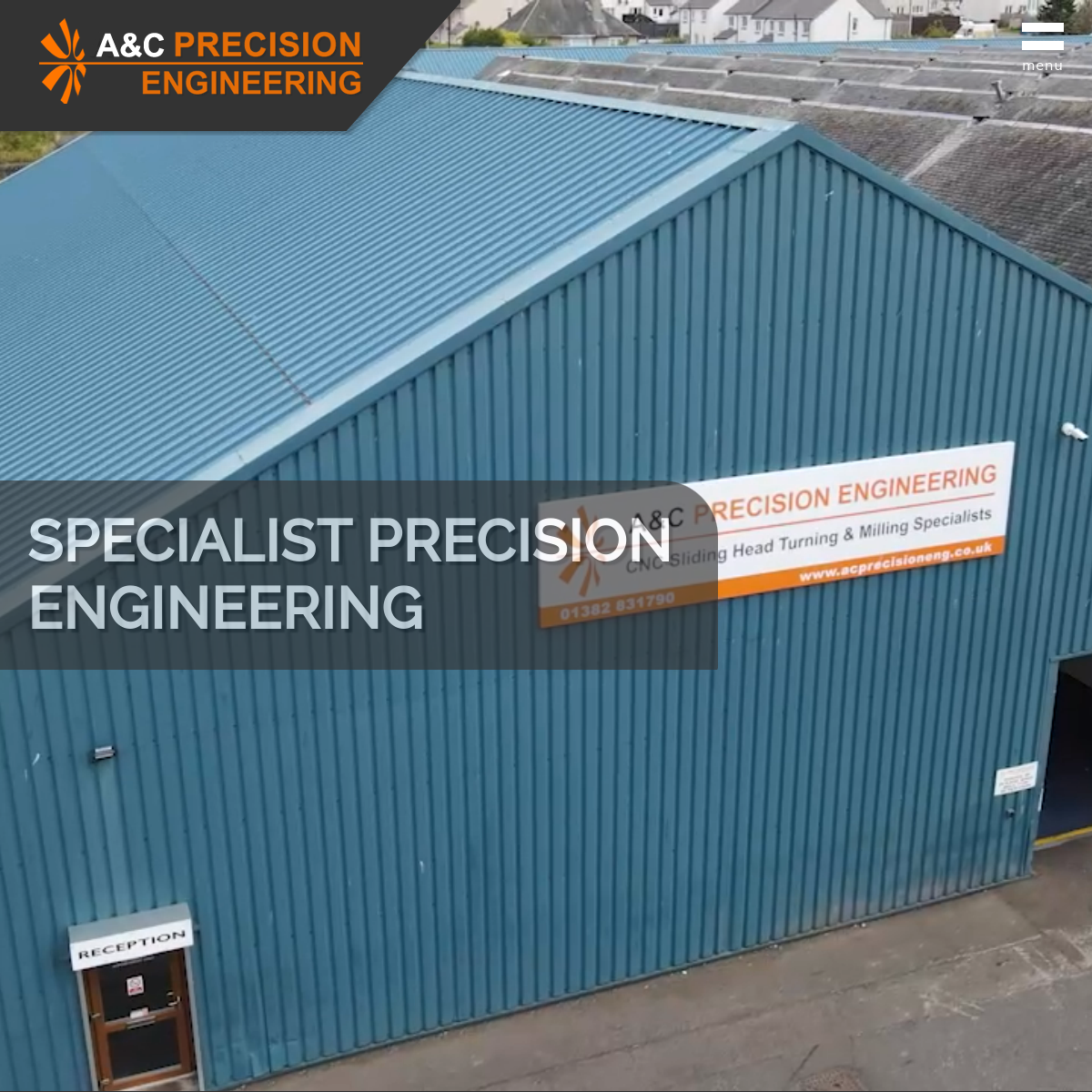
The original
Dated. Cluttered tiles. No clear hierarchy.
The site listed capabilities and showed machinery but the visual presentation didn't match the precision of the work. Inconsistent image sizes, competing text blocks, and a layout that felt like 2012.
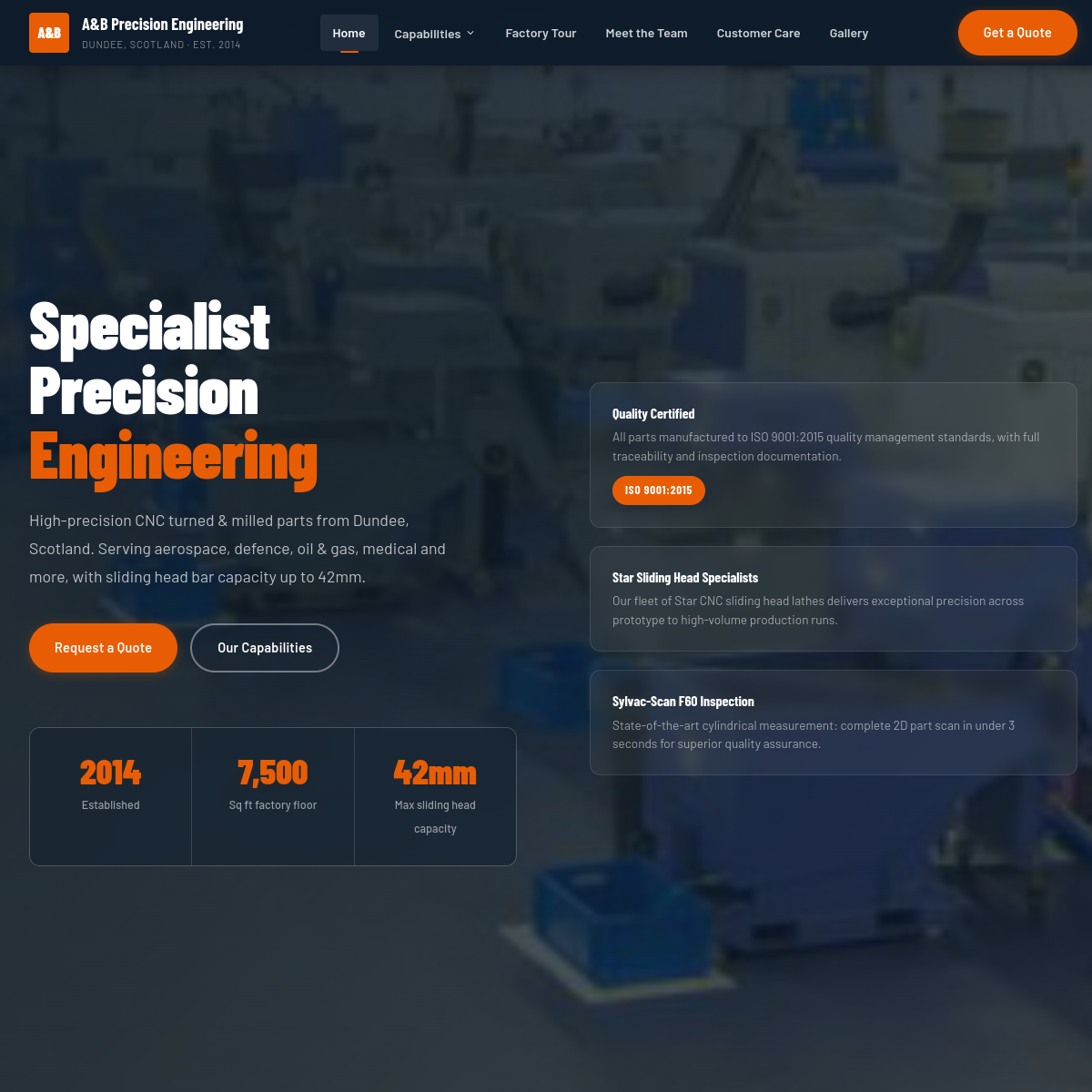
The redesign
Industrial precision. Modern presentation.
Grid-based layout where every section serves one purpose. The hero says what the company does in plain English. Capabilities and materials are scannable, not buried in paragraphs. The enquiry form is impossible to miss.
ISO 9001:2015certified precision
The point
Your site is your first impression.
Procurement teams google you before they email you. A dated website plants doubt before you've even quoted. This concept shows that industrial doesn't have to mean outdated.
Side by side
Drag to compare